I’m a creature of habit. I like knowing where to find things. I find comfort in the familiarity of it all.
I, along with the rest of the world, rage when Facebook makes the teensiest adjustment to the newsfeed.
So when Google started rolling out its new layout for Calendar, I let out a huge sigh of disgust.
I wanted to hate it, folks. I really, really wanted to hate it.
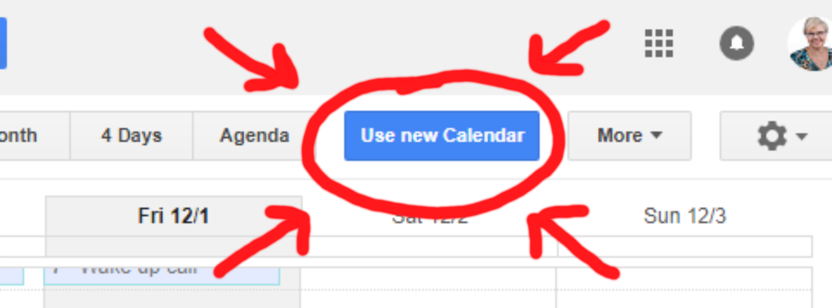
On Wednesday, this little blue button appeared on my calendar, and my life changed for the better.

(At this juncture, I have to point out that Jillian, my work wife and collaborator in business, had to work hard to convince me to click that button. I resisted. I whined. I complained. I probably even pouted.)
Although we’d both heard plenty of complaints about it, Jillian had already switched over to the new layout about a week earlier, and so far was happy with it. So like she does whenever I get my knickers in a twist about having to adjust to new things, she had me hop on Zoom so she could demonstrate some of the new features.
It took me about 3 seconds to fall head-over-heels in love. We spent the next 45 minutes or so playing around with it and basically geeking out over how powerful this new layout is, figuring out all the new bells and whistles (and improvements on the existing ones) so that you don’t have to.
Here are some of our favo(u)rite things about the new Google Calendar:
1. The New Year-at-a-Glance View
So in the classic Google Calendar, your calendar view options were Day, Week, Month, 4 Days (or Custom – this was something you could change to suit your preferences), or Agenda.
These options still exist, but a year-at-a-glace view has been added. And, it’s hot. Check it out:

OMG, be still my heart.
2. Adjusting an Appointment by 15 Mins is EASY
In classic Calendar, if you wanted to move an appointment by a 15-minute increment, you had to drill down into the appointment, manually edit it, and then click save.
With the new layout, all you have to do is click-and-drag.
Amazing.
3. Creating an Event in a Single Step
In classic view, if you wanted to add anything beyond the title of an event or appointment, you first had to create the appointment on the Calendar and then click on it to edit manually.
In the new layout, you can create the event/appointment in a single step.
To quote Jillian, that’s just efficiency.
4. Making Changes to Shared Calendars
Maybe you’re like me and Jillian and manage multiple calendars for both yourself and your clients.
Or maybe you juggle shared calendars for your family.
Either way, you probably encountered an issue where depending on the settings, you needed to log in as the owner of the calendar in order to make any changes to appointments.
Not anymore!!
5. The New Sidebar is Incredible
On classic view, the sidebar is static.
With the new layout, you can toggle it on and off.
For now, I’m keeping the sidebar on – I have to look at different shared calendars many times per day, so the less mouse-clicks and keyboard strokes the better. But with the sidebar off, it looks really clean and way less cluttered, so I can see how it would be a refreshing change for anyone who gets overwhelmed by being presented with a lot of information on a screen.
You can also add a new shared calendar directly from the sidebar, instead of digging around deep in the bowels of the calendar settings.
Speaking of which…
6. The New Settings Menu is Also Incredible
On classic view, going into the Settings to make any changes was a total pain in the patootie. There were so many screens and weirdly-worded options that were designed to confuse you (in my humble opinion).
If you’re a G Suite user, you’ll notice the Settings screen now resembles the overall layout of the G Suite Admin Console.
Essentially, it’s a lot more intuitive.
Everything lives on one screen, so you don’t need to toggle between different tabs to find what you’re looking for.
Once we braved the Settings Menu, that’s where we REALLY discovered the power behind the new layout.
For example…
7. Adding a Secondary Time Zone
HOLY SHIT.
This feature is goddamn LIFE. CHANGING.
At least, it is for folks like Jillian and I who work with clients and subcontractors across multiple time zones.
And as if this feature wasn’t amazing enough – you can also label your time zones. I’ll show you what I mean in a screenshot in a bit. But seriously, our minds are blown.
But wait! There’s more!
8. Option to View Calendars Side-by-Side in Day View
This, coupled with the secondary time zone, is the new Google Calendar’s pièce de résistance.
Trying to find a free block of time when managing calendars for 2 or more people? This view is for you.
Just, I mean. Look at it:

Thing. Of. Beauty.
(Also, note the 2 time zones listed between the sidebar and the Day view… I labeled mine Jillian and Katy, but you could call them whatever you want.)
I only have 2 calendars showing in this screenshot, but you can view many more side-by-side just by toggling on any of your other shared calendars.
Like, woah. Is it getting warm in here, or is it just me?!
There are probably a kajillian more things the new Google Calendar layout can do, we just haven’t figured them all out yet.
On Friday, December 8th, 2017, Jillian and I are going to host a livestream where we’ll play around with the new layout and demonstrate it in real-time. Register over here.
In the meantime… have you found any other cool new (or new-to-you) functions in the new Google Calendar layout? Let me know in the comments!


